Packaging design is a vital component of any brand’s identity. A powerful marketing tool in itself, a product’s packaging speaks volumes about the brand, the product itself, and the positioning it aims to establish in the mind of the consumer. Akin to the culinary world where one first “eats with one’s eyes”, in the realm of packaging design, it is critical to get consumer attention and have them gravitate to a product’s packaging. Essentially, packaging design is all about creating a unique brand or product experience for the consumer!
Well-designed packaging, especially in the food and grocery segment positively influences product sales. With a host of products jostling for space on crowded retail shelves, marketers today are faced with the challenge of creating powerful brand experiences that build emotional connect, enabling consumers to make empowered decisions. Much of the magic in achieving this lies in getting the packaging spot-on!
A variety of factors work in tandem to guide the packaging design strategy that a brand will adopt. Some of these factors arise out of specific consumer behaviour patterns and trends, while others emerge as a consequence of contextual situations and current affairs pervading at the time. Myriad elements that operate at various levels – emotional, physiological, social, cultural, political, economic, etc. influence a consumer’s decision making process and thus inform a brand’s packaging design strategy.
At Therefore Design, we work with brands to create powerful experiences that ensures consumer connect. As a strategic design consultancy we collaborate with brands to develop packaging that is relevant, functional, aesthetic. In our vast experience we have found that packaging design is essentially governed by five omnipresent factors. Each one of these factors is important, however based on a brand’s specific context one of these becomes central to the brand and its packaging design strategy.
1. Mindful and Aware Consumers
Consumers are increasingly making decisions about the food they wish to consume with the help of a whole new set of values and social conscience. Attaching morality to their buying choices implies they tend to look for products and packaging that have a sustainable, environmentally-friendly, health angle, or anything else that connects with their beliefs.

Consumers are constantly on the lookout for healthy snacking options. Recognizing the potential of Haldiram’s Moong Dal we took on the challenge of repositioning this traditional Indian snack as a health snack of today. Moong dal, a staple in most Indian kitchens, is a versatile lentil renowned for being high in protein and a rich source of fibres. It was therefore essential that the packaging highlighted these health features, re-kindling this forgotten knowledge in the minds of the consumers.
We used impactful RTBs (Reasons to Believe) such as ‘Rich in Protein’, ‘Zero Trans-fat’, ‘No Cholesterol’, ‘High Dietary Fibre’ and ‘43% Less Fat’, prominently on the front of the pack to make it a compelling choice for health-conscious consumers.
We harnessed the back of pack to communicate lesser known facts about Halidram’s environment friendly initiatives such as the fact that their factory is entirely powered by solar energy. Thus reinforcing the ethical and conscientious side of the brand. Incorporating small design changes enabled us to shift the look and feel of the pack from ‘traditional’ to ‘contemporary’.
With the redesign of this pack we have begun a journey in shifting consumers’ perception about Haldiram from that of traditional company to a conscious brand that is in sync with the times.
2. Listen and Talk to the Consumer
When brands listen to what consumers are saying and understand what they want, it can lead to break through ideas that really address consumer concerns and align with their life’s beliefs. Critical steps towards building brand loyalty.
When working with Gadre to repackage their frozen seafood range our research brought to light that buying seafood is an intimidating experience for most young consumers. Tapping into the gaining popularity of stand-up style of comedy, we used fun one liners and puns to support the product name and charm consumers. The aim was to make them laugh or atleast smile and in doing so make the purchase process less stressful. Our witty play of words was complemented with illustrations and evocative product photography that aimed at arousing buyers’ curiosity, engaging them intelligently, all the while making the products more approachable.

This packaging refresh has helped Gadre bring many new consumers into the fold, while building a strong following amongst existing consumers. In making the packaging interactive and colloquial, we also achieved the objective of creating an aspirational, international look and feel that encourages brand recall.
3. What’s Happening on the Shelf?
A brand’s ability to stand out on a shelf determines the ease with which it will be seen and then picked up by consumers. Sometimes, to do that, takes a bold step, that of moving away from conventional design strategies adopted by most brands and do something very different.
Delicious, a frozen ready to eat range of products by Baramati Agro needed a packaging refresh to up the brand’s ability to compete with established players in the segment. This we achieved by choosing to defy standard norms of packaging!

A study of supermarket freezers revealed to us that brand differentiation was a challenge, since most players in the category used the colours yellow and red. Almost identical range of products, further added to the difficulty of making a quick choice. Pack architecture across competition was almost constant with the product image accounting for 30% percent of the pack. Products being similar across competition this lead to very little differentiation between brands.
Moving away from this popular convention, our design strategy focused on the product name rather than the product image. We created an iconic, ownable element using bold 3D text, which in turn worked to garner attention, improve brand visibility and recall. Instead of relying on the colours already prevalent in the market, we used minimal colours in our design, further amplifying our differentiated style. This strategy helped to transform the look of the freezer and position :Delicious as a premium brand within the category.
4. Back to Basics
With health and wellness often occupying consumer mind space, many denizens are choosing to eat the kinds of foods their grandparents ate, and support locally grown produce. Millets like jowar, bajra, ragi etc. are gradually returning to urban kitchens, prompting companies to cash-in on this trend.
When Future Group launched the brand Desi Atta Company with the thought of bringing convenience in traditional cooking into urban kitchens, the packaging assumed importance in driving retail sales. We developed a visual strategy for the brand to help consumers identify with the brand pillars, that of tradition and convenience.

A traditional Indian home’s rustic kitchen counter, dark mood lighting contrasted with a vibrant brand colour gave the packaging a distinct look. The brand owned the colour on the shelf! We incorporated the regional name of each product on the pack while reserving the top band of the pack to indicate the recipe’s regional association to appeal to local markets across multilingual and multi-cultural India.
Building consistency across product categories, we gave the ready mix packs a natural colour to nullify the connotation of ‘unhealthy’ that ready mixes are otherwise associated with. Building in convenience was core to the strategy and we took special care for the back of pack. A crisp graphic style was visualised for the directions of use. A link to recipes taking consumers to the Desi Atta website and a prominent product name at the back, were some of the key design decisions we incorporated for Desi Atta Company.
5. Current Affairs and Contexts
Trending news and current affairs, are often responsible in determining the way consumers engage with products and brands. Pure milk ice cream in India was one such issue, recently in the news, with competing brands trying to build strong pure milk associations in the consumer’s mind.
This market influence played a critical role in the design strategy of the Vadilal Quick Treat ice-cream range. At the time Vadilal was looking to reposition its export range of ice-creams to compete in the premium segment and we grabbed the opportunity to be the first to also bring the pure milk differentiator into focus.

Our research indicated that buyers were unable to identify Vadilal on the shelf due to a lack of distinct character. Once we had identified this shortcoming, our task was focused and decisive, prompting us to incorporate a strong brand colour, unique to the shelf that helped Vadilal command attention in the freezer.
We chose a central theme of spontaneous free flowing imagery with minimal design elements for the pack that pegged the brand in the premium segment, while powerfully establishing the pure milk connotation, which became central to the entire brand positioning exercise.
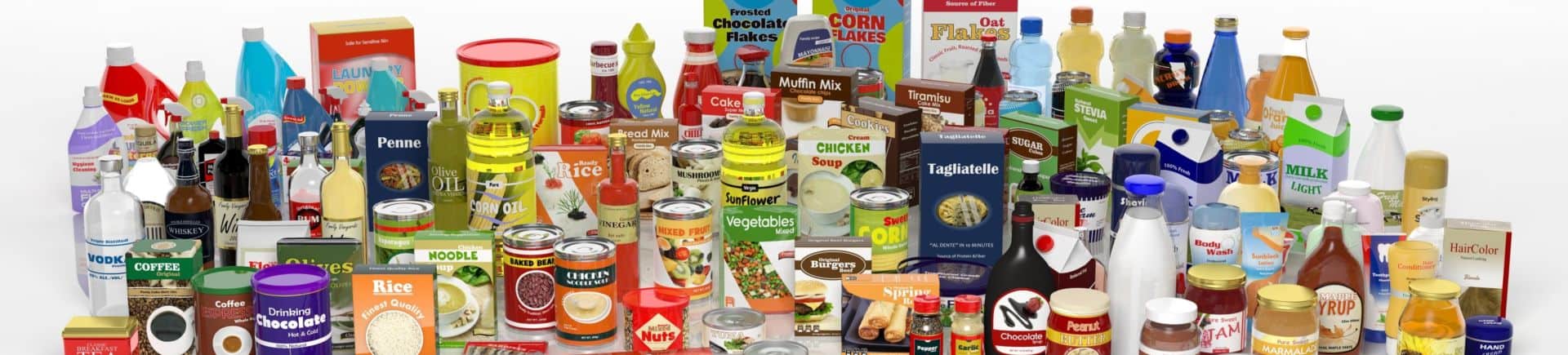
Consumers make in-store purchase decisions almost within a matter of seconds. Now imagine, your consumer is confronted with a vast variety of products and their competitive alternatives, all vying for attention in the same retail shelves. Quite an overwhelming experience for consumers, isn’t it? This is where packaging design steps in, to differentiate a product and provide consumers with the novel experiences that they seek.
Research has established that almost a third of purchase decisions in-store are governed by the packaging of a product. Which eventually brings us to the bottom line; your product may be the best, but the question you need to ask is are you packaging it right!
Strategist, Researcher, Co-Founder at Therefore Design
Founding Partner at Therefore Design, a Strategic Design consultancy that works in synergy with businesses to identify opportunities and explore their potential through design.
Spearheading Research and Strategy at Therefore Design, where we harness the power of consumer and market insights to help businesses bridge the gap between brands and consumers while delivering higher value.
Her expertise lies in the convergence of business and brand strategy which strangely enough many a times are at odds with each other. Having a unique mix of experience that enables her to strike a balance between the pragmatic considerations of clients and design thinking approaches that results in innovative yet practical solutions.


