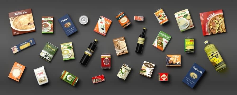
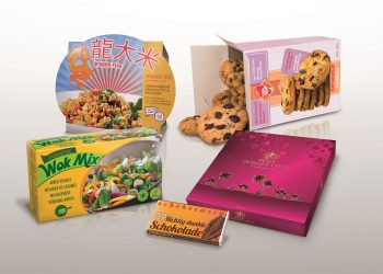
Packaged Food Industry is ever-growing as people are opting for convenient food due to paucity of time. Every day new brands are entering the market with packaged snacks, health foods, desserts and even complete meals on the go. With the industry expanding, packaging these foods in a logistically safe, visually attractive, technically and hygienically conducive material for long shelf life is increasingly important.
Choosing the right kind of Packaging is key to offering a great product and adding value to the brand and two key parameters for the same are :
1. The packaging should keep the food safe and aid convenience during consumption.
2. It should convey the right information about the food inside while being attractive and high on shelf-appeal.
While the first point involves a lot of food science and packaging technology, what I am focusing in this article is the second point, the chemistry between great packaging design and doling out the correct product information, that will enable the consumers to make an informed choice while at the shelves. The reason being, that consumer today is evolving and is conscious of what he wants to consume and there are brands that are working hard to suit all the consumer needs – low sugar, lactose-free, gluten-free and more. What else but Packaging, is the best medium to communicate these product details and talk to the consumer about how hard the brand has worked to get the product right.
Well, this is the positive approach to the packaging but, many brands have been notorious and taken liberties on the packaging to mislead the consumers to buy into overrated food products and empty calories without giving significant information about the same. Thankfully, since the last decade, there have been bodies regulating what is and what is not being talked about on the packaging in the form of visual and verbal communication. Hence it has now become imperative to integrate the comprehensive information about the product inside, be it ingredients, usage, consumption details which eventually aid the consumers to make the right choice.
With more and more bodies regulating this information, the authenticity of it is primary and many of them are active globally. FSSAI in India is the one that is currently regulating the laws for food industries, especially packaged food and beverages and is ensuring strict enforcement of the laws it has set for the same.
In announcing that the new regulation had been notified, Pawan Agarwal, CEO of FSSAI, stated that “the new packaging regulations would raise the bar of food safety in India to the next level.” He added that stakeholder consultation and mass awareness building amongst consumers and food businesses would precede the implementation of the new packaging regulations.
This, in turn, has a significant impact when it comes to packaging design, where the creatives find this “way too much information as a deterrent to their creative expression of the product idea”. However, I think otherwise and believe that creatives need to regard packaging design as a comprehensive piece of lawfully viable communication to the consumers and not just an aesthetically attractive pack to lure them into an unrealistic story. Well, there is no reason to get disheartened, I see this as more of a challenge and an opportunity to talk real with the consumers, tell them stories they will believe and you are sure to have them back looking for the same Brand.On the other hand, If not adhered to, it may cause serious implications for the brand, like withdrawing the products back from the shelf or taking other corrective measures to ensure the compliances are met.
It’s only a matter of understanding the simple rules set by FSSAI and using them as guidelines when designing. FSSAI does not really limit the boundaries in terms of creative expression but only defines to extent of fantastical representation by asking one to couple it with real-time information, for example, on a candy that only contains fruit flavouring and no fruit pulp, the creative representation cannot be that of real fruit. The challenge is to get creative and informative at the same time. It is essential therefore to know the Key Guidelines beforehand. This packaging revamp of the RX healthy bar is a classic example of creative information design for Packaging.

I am listing the key set of guidelines that the brands need to follow on food packaging and labels starting with general guidelines.
General Conditions
1. Any information or pictorial device written, printed, or graphic matter may be displayed in the label provided should not be in conflict with the requirements of these Regulations.
2. Every declaration which is required to be made on the package under these regulations shall be:
(i) Legible and prominent, definite, plain and unambiguous
(ii) Conspicuous as to size number and colour,
(iii) as far as practicable, in such style or type of lettering as to be boldly, clearly and conspicuously present in distinct contrast to the other type, lettering or graphic material used on the package, and shall be printed or inscribed on the package in a colour that contrasts conspicuously with the background of the label Provided that —
(a) Where any label information is blown, formed or moulded on a glass or plastic surface or where such information is embossed or perforated on a package, that information shall not be required to be presented in contrasting colours.
(b) Where any declaration on a package is printed either in the form of a handwriting or hand script, such declaration shall be clear, unambiguous and legible.
3. No declaration shall be made so as to require it to be read through any liquid commodity contained in the package.
4. Where a package is provided with an outside container or wrapper, such container or wrapper shall also contain all the declarations which are required to appear on the package except where such container or wrapper itself is transparent and the declarations on the package are easily readable through such outside container or wrapper.
5. Labels not to contain false or misleading statements: A label shall not contain any statement, claim, design, device, fancy name or abbreviation which is false or misleading in any particular concerning the food contained in the package, or concerning the quantity or the nutritive value or in relation to the place of origin of the said food: Provided that, this regulation shall not apply in respect of established trade or fancy names of confectionery, biscuits and sweets, such as, barley, sugar, bull’s eye, cream cracker or in respect of aerated waters, such as, Ginger Beer or Gold-Spot or any other name in existence in international trade practice.
The principal display panel (PDP): The information required under these Regulations shall be given on the principal display panel of the package or container and such information may be given in the following manner:
1. Name of the food including the trade name and the description should be clearly mentioned on the PDA/ FOP
2. Vegetarian and Non-vegetarian food declaration to be done with the right sized Green and Red marks respectively on the PDA/FOP
3. Ingredients to be listed as per the guidelines on BOP
4. Correct Nutritional information in a suggested table format
5. Name and complete address of the manufacturer and the marketer to be communicated clearly along with customer care details
6. Net Quantity in terms of Weight, Volume or Number to be declared clearly
7. Retail sale price and expiry date should be an easy find on the pack
8. FSSAI logo and license number of the Brand to be mentioned in the bold specification.
9. Batch identification number, the date of marketing, country of origin
10. The instructions for usage or preparation should be clear. Visuals depictions, in this case, work better.
11. Allergy warnings should be stated clearly.

So the content framework for the pack, especially the BOP needs to largely follow the FSSAI guidelines but can be designed in the coherence to achieve the desired creative output.
a. On the Front Panel :
The key drool visual on the pack can take a flight of fantasy but with a disclaimer that the depiction is for presentation purpose only. Misleading the consumers with over-exaggerated and senseless product depictions can only harm the brand in the long run, as trust plays a key role in brand building. The product has to deliver what had been depicted and vice versa.
b. If the product is inherently healthy and has solid claims, they can be very interestingly integrated as a part of the visual vocabulary on the FOP. It helps to build a distinct identity for the brand and its offering and talks aloud and clear on the shelf.
c. Avoid depicting real fruits, veggies etc. on products that do not contain those ingredients in the required percentage. Especially in the beverage category, that act as a key differentiable between a Fruit Flavored Drink and Fruit Juice. As designers, we can take up the challenge of communicating the right information in a most aesthetic way to help the consumers to choose, when at the shelf.
d. Avoid using misleading nomenclature for Product descriptors, for e.g natural, healthy etc. cannot be used as a claim for any of the packaged products. Instead, if the product is low sugar or healthy alternative, generic terms like good for you, inspired by nature can help achieve the desired impact.
e. GDA panel or a mini nutritional panel mentioning the amount of energy, total fat, total sugar and salt per serving and the percentage contribution to recommended daily allowance is must on the FOP now. It is ideal to integrate it as a part of the design during the process itself seamlessly, so it does not look like a force-fit when placed after the entire creative is done.
f. Just like the visibility of branding and design is a key to great packaging, visibility of all the mandatory elements on the BOP is important and hence the colour and image play on the Back panel should be tackled accordingly.
Deepti, Partner, Director-Strategy & Design, Tricycle Tribe Creative Ventures Pvt. Ltd. has a decade of experience in the Branding Industry. She was one of the core team member of former Yellow now DYWORKS and her competent professional journey transcended her from a creative genius to a sharp Marketing Strategist. She founded WOW DESIGN in 2009 with an intent to make a mark in the Evolving Branding Universe. Due to some changing dynamics in the leadership team, WOW Design had to be dissolved as a company. She is now a co founder and Chief Design Strategist at TCT Branding, a futuristic branding company, that works with a holistic perspective towards Branding with core belief in Empathy driven strategies.


